Showing posts with label reviews. Show all posts

The Last of Us: Left Behind review


It says much of the quality and depth of The Last of Us' characters and world that Naughty Dog could have picked any one of a number of threads to explore in this, the first and only story expansion for its seminal action-adventure. The strained relationship between Joel and his brother Tommy; Marlene's journey from Ellie's guardian to head of the Fireflies; the story of Ish, the enigmatic survivor whose notes detail his harrowing experiences in Pittsburgh - any might have worked.

Instead, Neil Druckmann, Bruce Straley and their team have chosen to explore one of the defining relationships of our young heroine Ellie's life - her close friendship with a fellow teenage survivor, Riley. Those that have played through The Last of Us already know how this story ends and likely have an idea of how it might play out, and so it is to the developer's significant credit that Left Behind manages to defy foreknowledge to tell a story that is touching, revealing and important.

Left Behind presents an unexpected duality, contrasting the Ellie with whom we are familiar with one whom we've never met. Ostensibly, it is a snapshot of a pivotal time in Ellie and Riley's friendship that plays out against the backdrop of a post-outbreak world, a world in which quarantine zones and death are everyday considerations and where trips to the mall and carefree teenage frivolity are wholly alien concepts. To pick out any single instance of this juxtaposition would be to deny you the joy of discovery. Suffice to say that exploration is its own reward, and it's as amusing as it is poignant to witness the two friends walk amongst the relics of an opulent past and wonder aloud at the bemusing superficiality of it all.


In its way, Left Behind also serves as an examination of Ellie's later relationship with Joel. It offers insight into the depth of the bond that exists between the two and provides a deeper understanding of this relationship by exploring events that are only alluded to in the main story. In doing so, it once again turns the pseudo-father-daughter relationship on its head and offers still more to ponder in the main story's ambiguous ending. While there's certainly value in playing through The Last of Us again prior to starting Left Behind, there's also a surprising amount to be taken from venturing through the main story
Share On:

PS Vita Slim (2014)


PS Vita Slim (2014): First Impressions

What is the Sony PS Vita Slim?
The new PS Vita is the 2014 edition of Sony’s handheld console. It is cheaper, slimmer and lighter than its predecessor. Although Sony is keen to say it is still simply called the PS Vita, we’re sure it’ll quickly adopt the Vita Slim moniker.

The key selling point of the new Vita is its design, as the software and processing power under the hood are near-identical to the last model. It's slimmer, and has an LCD screen rather than an OLED one.

For existing PS Vita owners, those design tweaks make the latest model feel quite different from its predecessor.

PS Vita (2014) - Design
Sony has listened to gamer feedback to make the Vita easier and more comfortable to hold for long periods of time. Even when picking up the new handheld for the first time, the difference is clear.

25 per cent of the original Vita’s weight has been shaved off to make the latest model feel considerably lighter than the original. It's a welcome change. The original was by no means a heifer at launch, but in a direct comparison it feels like quite the dead weight.


The PS Vita Slim has a new soft, matt finish on the rear and the finger grips have been enlarged to help you endure those extended gaming sessions. These touches make the new model much more tactile and finger-friendly than the former gloss finish. The rear touch panel is still glossy though, so your fingers won’t notice a change there.

To help reduce accidental presses, the rear touch panel has been reduced by around 30 per cent. From our brief play with top Vita title Tearaway, the smaller touchpad doesn’t affect the way you play whatsoever. And it is still large enough to feel accessible and convenient without having to stretch your fingers too far.

Changes to the buttons are some of the more subtle design alterations, with the symbol buttons and d-pad receiving minor cosmetic changes. The start and select buttons under the right analogue stick are now small and round rather than oval, and the PS Home button is no longer backlit.

Instead there are a duo of LED lights at the top of the device to indicate power and battery levels.


The best new feature of the PS Vita Slim is Sony’s abandoning of
Share On:

Ipad Air: Logitech FabricSkin Keyboard Folio review


Pros
-Classy design with front and back protection
-Easy to remove iPad when you want
-Clever magnetic stand design

Cons
-Keyboard takes a little getting used to
-Pricey in comparison to alternatives


Logitech FabricSkin Keyboard Folio for iPad Air review

What is the Logitech FabricSkin Keyboard Folio?

As if to alleviate any doubt, Logitech seems determined to answer this question in full using just the name. As its title suggests this a folio case with a keyboard, while the 'FabricSkin' part refers to how the keyboard and outer shell are splashproof. It's Logitech's second attempt at such a case and it doesn't come cheap at £119, but it has a lot of plusses if you can overlook the price.


FabricSkin Keyboard Folio: Design

This version is a serious step up from the original FabricSkin Keyboard Folio. It still protects the front and rear of the iPad, but this version trades the soft touch material of the original for a hardier, more satisfying textile material over a hard plastic shell.

The combination gives the FabricSkin Keyboard Portfolio a more tactile feel, but just as important it's thinner and lighter than before. The old version, admittedly using a heavier iPad, weighed in comfortably over 1kg combined. An iPad Air and this Folio, however, are a more manageable 880g. It's a still a fair bit heavier than an iPad Air on its own, but it's far more in line with Logitech's popular Ultrathin Keyboard Cover for iPad Air than before.


This makes the FabricSkin a far more viable solution for anyone who wants a Folio-style keyboard and case in one, but doesn't want to sacrifice too much portability. It helps, too, that in this incarnation the FabricSkin Keyboard Folio looks very classy. The textile exterior looks far more professional and smart, while the choice of either a white or a (rather fetching to our eyes) yellow interior gives you a little choice.

All these improvements are great and the Folio's best feature remains: the magnetic clasp. This holds the iPad in place when in typing mode, with the Bluetooth connection automatically engaging (or disengaging) when its activated. It's a neat, very user-friendly touch that means you're never left wondering whether the keyboard is connected or not and saves on battery life -- Logitech claims up to three months when used around three hours per day.

One final plus point is that's it's very
Share On:

Ipad Air: Logitech Ultrathin Keyboard review


Pros
-Great typing experience
-Doesn't slip around on flat surfaces
-Comfortable angle for typing
-Clips on and off easily

Cons
-Only covers screen
-Large hinge is unsightly


Logitech Ultrathin Keyboard Cover for iPad Air review

What is the Logitech Ultrathin Keyboard Cover for iPad Air?

Logitech's reputation for great accessories is well-established, and it has long held the title of 'best keyboard cover for iPad' thanks to the Ultrathin Keyboard Cover. This is the latest version, adapted and tweaked to fit with new narrower, lighter iPad Air. Surely Logitech can't have broken a winning formula? Clearly not.


Logitech Ultrathin Keyboard Cover: Design

We'll deal with the obvious questions first. Making the Ultrathin Keyboard Cover smaller to fit the iPad Air has had no meaningful impact on the quality of the keyboard. Most keys are the exact same size, with only the Tab and Caps Lock keys being slightly smaller than before.

That's good news, though we were a little surprised to discover that iPad Air version is no lighter or thinner than the original. It weighs 330g on its own, or just under 800g when combined with an iPad Air. It's still impressively thin and light compared to the alternatives, but perhaps not as much as original compared to the iPad Air.


This fact isn't helped by the fact the hinge is a little chunkier and more obtrusive, a necessary evil due to the slightly curvier frame of the iPad Air compared to the steeply tapered edges of preceding iPads. You just notice it more than on the original. It's not a deal breaker by any means, but the fussiest of owners may take offense. Likewise, the slightly jarring gap along the front edge when closed is a little ugly.

Logitech has made some subtle improvements too, though. The old Ultrathin had a habit of slip sliding around on some surfaces, so Logitech has added a couple of small rubber feet at the front and a rubber strip at the back that runs nearly the whole length of the hinge. We're not sure the feet at the front are much use, but the strip at the rear does a great job preventing the keyboard from sliding as you type.


New version in black, old in red

As before the iPad sits in a narrow ridge when in typing mode, and you must detach the iPad from the magnetic hinge to
Share On:

Android 4.4 KitKat review


Pros
-Fast and frictionless
-New productivity options
-Project Svelte
-Improved Google Now

Cons
-Hangouts needs work
-Experience Launcher exclusive
-Hopped into bed with Nestle
                                                                            -No split-screen apps

1. Introduction 


Everyone was expecting Key Lime Pie to serve as the delicious moniker for the next version of Android. Google surprised us all by bucking tradition and releasing Android 4.4 under the name KitKat.

Version 4.0 started life as Ice Cream Sandwich, but the last three decimal additions came under the Jelly Bean banner. This new version was obviously deemed different enough to snag a new nickname, but not different enough to merit a jump to version 5.0.

That 0.1 bump hardly does it justice. Don't be fooled: this is an important step up for Android. KitKat is super-smooth, the UI is refined and elegant, there are improvements to the long-neglected calling and messaging side of the platform, a new focus on productivity, and your fortune-telling digital assistant is brought front and centre as Google Now reaches maturity.

 
General surprise in the tech world wasn't just based on the erroneous supposition that Key Lime Pie had to be next; there were also some raised eyebrows at the idea of Google entering into a tawdry cross-licensing deal with Nestle which would see a flood of Android-shaped KitKats hitting the shops offering buyers the chance to win Nexus 7 tablets or Google Play credit.

According to Google the promotion was its idea and no money changed hands. With Nestle producing 50 million Android KitKat bars it certainly looks like a sweet deal for them.

Naming conventions aside, the 4.4 update is about addressing some of the Android criticisms that simply won't go away and it does so with aplomb.

There's a real focus on the consumer here, with a smattering of useful new features, a noticeable bump in performance, and some optimization to ensure that budget hardware is not left behind.

Android 4.4 is easily the best version of the platform to date, and Google has left the ball firmly in the OEMs' court when it comes to rolling out the upgrades.

Leading the field by extending the update beyond its Nexus line to the Moto G also neatly illustrates the move to improve the Android experience on low-end, affordable hardware.

First impressions

KitKat really makes a mockery of the idea that iOS 7 is more refined than Android. This
version of the platform
Share On:

Sony Vaio Fit 11a Flip Hands-on


Sony Vaio Fit 11a Flip review: Hands-on at CES 2014

What is the Sony Vaio Fit 11a Flip?

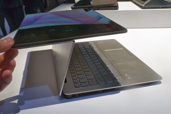
The Sony Vaio Fit 11a is an 11-inch laptop with a clever second screen hinge that lets you flip the screen around, turning the keyboard base into a stand for the display – perfect for watching films or showing someone else what's on-screen. You can also close the laptop with the screen on the outside, turning it into a chunky tablet. To give it more tablet cred, the Fit 11a also has an active digitiser pen. It's a smaller version of the other Fit laptops Sony released last year.


Sony Vaio Fit 11a – Design and Features

The Sony Vaio Fit 11a is a curious mix of things. It's a Ultrabook-ish laptop, it's sort-of a tablet, and it has elements of a graphics tablet too.

It's more than a normal laptop because of two things – the Active pen and the second hinge that sits halfway up the laptop lid. The latter earns the Vaio Fit 11a the title 'flip' computer, because the screen literally flips over, back onto the outside of the laptop lid.

To some this may seem less useful than a full hybrid, because when in its tablet-like form it's very thick for tablet. It's arguably a bit thick to be called an Ultrabook too, although doubtless some will call it one. It weighs 1.27kg, which is light enough to carry around without shoulder ache, if not particularly notable given the screen size.


It's a nicely-built laptop, though, which is a necessary reassurance when the secondary hinge is an obvious point at which the Vaio Fit 11a may fail. It doesn't feel immensely strong but Sony says it has tested the hinge with 20,000 cycles of movement – which we can't really argue with.

The lid is made of metal, but the inner part of it is plastic. It's understandable as this is not an exceedingly expensive laptop. We don't have UK prices, but the Fit 11a starts from $799 in the US – so it'll sell for well under £1000 here.

It's also not a super-powerful PC, though, using a quad-core Pentium N3520 processor rather than the speedier Intel Core type. You get 128GB of storage and 8GB of RAM, although the spec may change slightly when it hits our shores.


Sony Vaio Fit 11a Flip – Screen and Pen

The Sony Vaio Fit
Share On:

Valve Steam Controller Hands-on


Pro
-Precise
-Novel and fun to use

Cons
-Can it keep up with mouse and keyboard players?


Valve has several hurdles to hop before it can turn PC gaming into a living room experience. Besides getting the Steam Box to market with its 13 hardware partners and pushing the SteamOS, it needs to get PC die hards to give a controller a chance.

That's the task the Valve Steam Box controller has before it, and it's no easy one. It needs to offer the versatility and precision that approximates the mouse and keyboard setup.


While Valve has opted to license its SteamOS to hardware partners, it will be manufacturing its own controller. During an offsite event at CES 2014 I had the chance to take Valve's Steam Box controller for a test drive across multiple genres of games.

Now Valve won't be the only one making a Steam controller, those third-party hardware partners will be entering the fray as well. It also won't be forcing anyone to give up the mouse and keyboard. That classic gaming setup may not be couch optimized, but it will be an option for those who value the old ways of fragging a foe.


Valve staff on site at the event told us that the controller we were trying out is not a final build. The Washington-based gaming empire is a bunch of perfectionists, if nothing else. They told us they already had tweaks in mind for the button layout, the form factor and overall feel of the controller.

With that in mind here are our impressions of Valve's Steam Box controller, after diving into a little single player gaming on an internal Valve Steam Box.
Light, nimble and precise

Holding the Steam Controller for the first time I was shocked by its weight, or lack thereof. It's light, to the point where I thought it might be hollow.

That's likely because Valve's final Steam Box controller will be wireless, and the demo versions I used were wired by microUSB. Having a battery in there will definitely add some heft. 


The build is plastic, of course, but feels like quality work. The matte finish shrugs off fingerprints and felt as comfortable and natural as an Xbox One controller.

The most unique aspect of Valve's controller has to be the touchpads. Instead of the analog sticks of a standard console controller you've got two touchpads for
Share On:

The Shure SE846


Shure SE846 Review: Hands-on at CES 2014

What are the Shure SE846?

The Shure SE846 are noise isolating earphones. They're the highest-end earphones we've seen from Shure, costing more than double the amount of the Shure SE535 – themselves highly acclaimed earphones.

They're interesting technically and sound fantastic if you like your music with real bass clout.


Shure SE846 – Design and Features

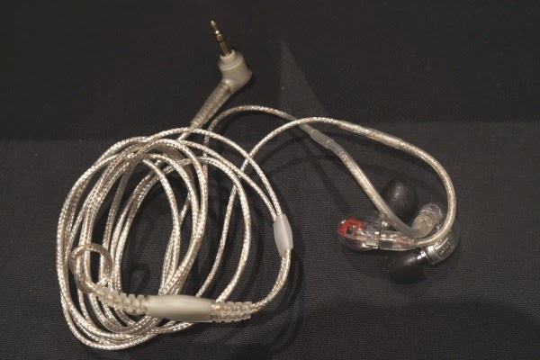
The Shure SE846 are quad-driver earphones, adding an extra driver from the previous flagship SE535 model. They don't look hugely different from the other top-end Shures, though.

There a bit bulbous, and are designed to be worn over the ear, with a stiffened length of cable up by the join with the earbud. Build quality takes a step up with the SE846, and the earphone aperture is made of metal rather than the usual plastic.

This is really necessary as you're able to take the end of the earpiece off. Like the AKG K3003 and Phonak PFE 112, the Shure SE846 use removable filters that tailor the sound to your taste. You need a little tool to do so, and we wouldn't recommend doing it daily, but it's a neat idea. Shure explained that there are three different filters, and they alter the mid-range response, giving you a balanced, mid-heavy or slightly scooped sound that emphasises the treble and bass a little more.


Like the other high-end Shures, the SE846 cable is removable – a good job given how much these earphones cost.

There's a lot of clever engineering that has gone in these headphones, and Shure shows it off with a clear finish that lets you see the micro driver housings.


Shure SE846 – Sound Quality

Although it's easy to think of the SE846 as merely a four-driver version of the SE535, there's actually some different things going on inside. The output from the bass driver is sent through a maze of tiny little metal holes designed to filter out all the frequencies a bass driver isn't designed to handle – so the bass driver functions much like a hi-fi subwoofer, leaving out the top-end and upper-mid frequencies.

The result is immensely impressive bass. The comparison with a subwoofer is a good one too, as we've rarely heard bass this punchy, this low, this powerful, in a pair of headphones, let alone a pair of IEMs. It's seriously impressive, and is the characteristic that really separates the SE846 from the SE535.
Share On:

Epson Moverio BT-200 smart glasses review


Pros
-Picture can look great
-Sleeker than BT-100
-Cheaper than Google Glass
-Runs full Android OS

Cons
-Awkward to wear, especially over glasses
-Image loses focus easily
-Still expensive
-Decreased resolution

                                                                                              -Big, awkward cord


Epson finally unveiled the successor to its Moverio BT-100 smart glasses at a pre-CES press conference, and understandably it's called the Moverio BT-200.

The new Moverio is sleeker than its predecessor and cheaper than Google Glass (though it's still expensive), and it comes with an Android-powered handheld touchpad input device.

But somewhat contrary to Epson's message up until now, this version of the Moverio is by no means focused solely on enterprise purposes.

That is what the company was showing off in December, but with the new BT-200 comes a swathe of consumer-directed capabilities, from games to a full version of Android.

The obvious changes

There are several important physical improvements in the BT-200.

The new Moverio smart glasses project a transparent 960 x 540 resolution display (yes, it appears the resolution has been decreased from the BT-100) in front of wearers' eyes using two projectors, and are capable of projecting 3D images. Motion sensors detect the movements of your head, and Dolby Digital surround sound pumps noise into your ears.


They also have a front-facing camera with an LED indicator light, though we didn't get to test that out yet. It also has a microSDHC card slot and Bluetooth and Wi-Fi support.

The touchpad controller is technically new, although it's more or less exactly what we saw Epson and APX Labs experimenting with late in 2013. They wouldn't confirm then that the touchpad would be the final input solution, but here it is.

Unfortunately that also means you're constantly tethered to a big, awkward cord when you're wearing it, so that's one down side. 


As a result of having a reliable and consistent input source the BT-200 is also confirmed to be running a full version of Android. The versions available to test after Epson's CES press conference ran Android 4.0, and apps could be selected easily using the touch pad to move a cursor.

The BT-200 is also much easier on the eyes, and on the face - though it's still extremely awkward to wear it with glasses.


One thing Epson has done to alleviate that is to create a special nose piece on the BT-200 that can fold down to rest on the
Share On:

Panasonic TX-L65WT600 review

Pros
-Stunning 2,160p performance
-Funky, futuristic design
-My Home Screen user interface


Cons
-Weedy audio performance
-Uncomfortable 3D glasses

-Price


Panasonic's Ultra High Definition debutant is able to display 4K faster than any of its rivals.

4K native content may still be as elusive as big cats on Bodmin Moor, but Panasonic is already thinking ahead. The big Panasonic TX-L65WT600 is the first TV in the world to offer compatibility with high frame rate 4K. Expected to be embraced by Sky and other broadcasters in 2015 (that's our guess), 50/60Hz Ultra HD adds a silky smoothness to the astonishing clarity of 4K images.


Panasonic TX-L65WT600: Features

As the premium screen in Panasonic's panel posse, there's nothing missing from the WT600's feature slate. The brand's My Home Screen Smart TV interface allows you to customise your app and streaming TV experience, and includes a native 4K resolution web browser, while the inclusion of multiple tuners also opens up novel viewing options, from MultiView windows to smartphone integration.

However, its key provision is HDMI 2.0 compatibility and a 4K-capable DisplayPort input. The latter is particularly useful as it can be used right here, right now to play 4K games at 60 frames per second via a tricked-out PC and graphics card.

So how has Panasonic effectively leap frogged the current HDMI 1.4K standard which tethers the other 4K set makers? Because it owns a semiconductor business able to manufacture HDMI 2.0 compatible silicon, that's how.


Panasonic TX-L65WT600: Design

The WT600 looks decidedly futuristic. Just 56mm thin with a super narrow bezel that doesn't detract from its imagery, it wears its huge screen size with surprising elegance.


Panasonic TX-L65WT600: Specs

Connectivity is where the WT600 steals a huge march over rival 4K screens. Not only are there four HDMIs, one of which is HDMI 2.0 compatible, there's also a DisplayPort input. This connection standard may be more commonly associated with Apple laptops and PC graphics cards, but it's essential to enjoying 4K 50/60Hz content now.

There's also museum-grade Scart and component/composite compatibility, a trio of USBs (one designated for external hard drive recording), Ethernet, SD card reader and an optical digital output. Wi-Fi is integrated.


Panasonic TX-L65WT600: Performance

We've waxed long and lyrical over the image quality available from first-generation 4K televisions. With 8m pixel density they offer photographic smoothness, even with upscaled Full HD content. But none deliver 4K resolution running at 60Hz.

Hooked up to a PC media player this screen is capable of a kind of hyper reality. The picture
Share On:

Canon Powershot G16 review


Pros
-Full manual control
-Raw format shooting
-Built-in Wi-Fi

Cons
-No touchscreen
-Limited flexibility with digital filters
-Can't use Wi-Fi for remote shooting


1. Overview


The Canon GXX series has long been considered the natural back-up camera for DSLR users, especially those already familiar with the Canon brand.

As such, the outward design of this range has changed little from its first incarnation. The Canon PowerShot G16 is no different, looking outwardly almost identical to the year-old Canon PowerShot G15 it replaces. But of course, inside there have been a few notable changes.

First up is the sensor. While it remains the same pixel count, at 12.1MP, and physical size, at 1/1.7-inch, Canon says that the CMOS sensor is a completely new design, featuring back illumination.


The Canon G16 now includes inbuilt Wi-Fi, something which Canon's David Parry says is "pretty much essential" for new compacts.

What Canon is most keen to shout about, and perhaps the most exciting new feature, however, is the Digic 6 processor. This is Canon's latest generation of processor which enables some pretty special things, most notably an impressively fast 9.3fps (JPEG, without continuous autofocus), which doesn't have a buffer - in real terms that means you can, in theory, keep on shooting until your card runs out. It also means you can shoot a sequence, stop shooting and be ready to shoot again.

It should also mean that low light performance is once again improved. The Canon G16 is capable of shooting at up to ISO 12800. Canon also claims that AF speed has been significantly improved - apparently it is 41% quicker than its predecessor, the Canon G15.


Two new creative modes have been created for this camera. Background Defocus shoots two photos, one completely in focus, one out of focus, then combines the two images to produce DSLR-style background defocus effects. This is done in-camera automatically.

The second is Star Mode, which has been designed with night time photographers in mind. Canon says that it is so confident of the camera's low light capabilities that it actively wants to encourage photographers to use it in pitch black conditions.

Star Mode is a fully automatic mode that triggers the best settings for capturing night time skies. It's also capable of recording star trials and creating time-lapse movies - again, all captured and created within the camera without the need for post-processing. HDR mode
Share On:

Sony SmartWatch 2 review


Pros
-Lots of apps available
-It does work

Cons
-Limited battery life
-Awkward to setup


Key Features: 1.6-inch display; Bluetooth and NFC; 200MHz Qualcomm M3 CPU
Manufacturer: Sony


1. Design and Setup


Sony SmartWatch 2 - Design and Setup

What is the Sony SmartWatch 2?

The Sony SmartWatch 2 is among the latest wave of wearable tech, arriving alongside the Samsung Galaxy Gear. It’s a Bluetooth-enabled watch, and it costs around £150.

It’s a little more accessible than the Samsung Galaxy Gear, being much cheaper and offering much wider phone support (most phones Android 4.0 or newer). However, it does show why the smartwatch is one of the most maligned areas in tech. They claim to be devices of the future, but in-use too many elements feel like retrograde steps into the past.


Sony SmartWatch 2 – Design and Setup

Conscious, perhaps, that smartwatches are at risk of being dismissed as gimmicky toys, Sony has made the SmartWatch 2 feel very sturdy. The front panel remains very gadgety-looking like the first-gen SmartWatch, with a chunky square fascia, but the strap we got to test is a chain of black metal links. It’s the sort of watch strap worm by men who like manly pursuits and dream of owning sports cars.

The Sony SmartWatch 2 is also quite large and heavy. Not only is everyone around you going to notice it on your wrist – you’re not going to forget it’s there either. We also had some trouble altering the size of the strap. It’s not a standard, easily-adjustable plastic strap, you need to manually remove links with a tool.

However, you can buy other straps, including less chunky, non-metal ones. And the look isn’t all bad. The SmartWatch 2 looks more upmarket than the first Sony SmartWatch, and the bevelled silvery edge of the watch face is a nice touch. Still, it has won few fans among our team.

The watch is rated to IP57 weather resistance, meaning it can be submerged in water and is dust-proof. However, you’re not meant to take the watch swimming.


The one potential fail point that could let water in is the microUSB charge socket on the side, which is covered by rubber-sealed flap. Any water resistance disappears along with its integrity, and as the watch needs to be charged regularly, there’s a decent chance you’ll end up causing minor damage to the seal after time.
Share On:

Nikon Df review


Pros
-Full-frame sensor
-Small body
-Traditional controls
-Weatherproof

Cons
-'Only' 16MP
-No video recording
-Expensive


1. Overview

After the shock that Nikon treated us to a few teaser videos in the run-up to its announcement, perhaps the biggest surprise with the Df is that Nikon has gone for a 16.2 million-pixel FX (full-frame) CMOS sensor.

Some might have been hoping for a 24.3MP sensor like the Nikon D610 or a 36.3MP sensor like the Nikon D800, but Nikon has opted to use the same sensor as in the Nikon D4.

However, the benefit of opting for a 16MP sensor is that the photosites themselves are bigger and this means that they receive more light and generate a stronger signal which requires less amplification. As a result, less noise is generated so images are cleaner.

Data from the sensor is processed by the EXPEED 3 processing engine, the same engine as is found in the Nikon D610, D800 and D4. It seems odd that Nikon hasn't gone for the EXPEED 4 engine found in the D5300, but nevertheless the processor allows the sensitivity to be set in the native range ISO 100-12,800, with expansion settings pushing it to ISO 50-204,800. That's a match for the D4.

Meanwhile there's a maximum continuous shooting rate of 5.5fps for up to 100 images and images are stored on an SD/SDHC/SDXC card. Unlike Nikon's other FX format cameras, there's only one card port in the Df.


While the Df's body may be new (well retro really), the majority of its components are familiar.

The AF system is the for example, uses the same Multi-CAM 4800 module as the D610 and has 39 AF points, 9 of which are cross-type. The 2,016-pixel RGB sensor that gathers information for the Automatic Scene Recognition System and informs the white balance, focusing and metering systems is also familiar.

On the back of the camera there's a 3.2-inch 921,000-dot LCD screen just like the D610's. In live view mode this can display a nine-cell grid that conforms to the rule of thirds and the scene can be cropped to give 1:1 or 16:9 format.


As it's an SLR rather than a compact system camera, the Df has an optical viewfinder which shows the image seen through the lens. This provides a 100% field of view and has 0.7x magnification as well as DX crop markings for when DX lenses are
Share On:

Griffin WoodTones Over-The-Ear review


Pros
-Seriously enjoyable sound
-Very comfortable

Cons
-Noisy headband spoils portability
-Design polarises opinion


Key Features: 50mm driver; Removable 3.5mm cable; Handsfree housing
Manufacturer: Griffin Technology


Griffin WoodTones Over-The-Ear review

What are the Griffin WoodTones Over-The-Ear?
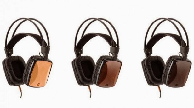
The Griffin WoodTones Over-The-Ear are full-size headphones that are topped with wood to give them a look that’s a bit different from the competition. These are not the first wooden headphones Griffin has made – the WoodTones join a few different in-ear pairs.

Great sound and good comfort make them a solid purchase - and great value at the price - although we’re not sure about the look and a weirdly noisy headband ensures they’re not much good for use while out and about.

Griffin WoodTones Over-The-Ear – Design and Comfort
If you know Griffin, it’s probably for its phone cases or other accessories. However, these  Over-The-Ear WoodTones headphones are not the generic type of cans we often see from accessory makers.

The back of each earcup is topped with wood. We expect it’s a purely aesthetic choice, much as Griffin’s marketing implicitly suggests that it’s responsible for some of the sound’s warmth. You can choose between three finishes – beech, sapele (aboudikro) and walnut.

Although the look has won acclaim elsewhere, we’re not entirely convinced by the slightly IKEA furniture look of the beech sample we’re currently enjoying. However, if you’re reading this you may well be drawn in by the distinctive style of the Griffin WoodTones Over-The-Ear.

Aside from the wooden parts, they are of a fairly standard design, and not one that’s particularly style-driven. Rectangular cups, a headband exoskeleton that sticks a way above your head and the fairly large size aren’t going to win these WoodTones many fans among the Beats by Dre crowd.


However, they are very comfortable indeed. The plastic (apart from the wood, of course) construction keeps them light, the pads are very soft indeed and we find the auto-adjusting headband particularly comfy.

The headband is a wide strip of fake leather that’s kept taut on your noggin by an elasticated band inside it. As comfy as it is, the headband does introduce a fairly serious problem. It continually readjusts from your movements while walking, and it causes a seriously annoying creaking sound. It’s the headband rubbing against the elasticated band inside. For at-home use it’s no problem, but we don’t recommend the Griffin WoodTones Over-The-Ear for commuters. It’s a
Share On: